From Idea to App - How to create Wireframes

In our previous post, we set up the first steps to create the MVP for our task list app. To start, and clarify the picture about what we are about to build, we create wireframes.
Objective
To recap, the goal of the app is to make users able to manage their tasks in the most user-friendly way. We need to make the workflow fast, and intuitive.
Our core component is tasks, and we need to provide ways to:
- display tasks
- add tasks
- edit the tasks’ properties (completion status, name)
- delete tasks
What is a wireframe?
Wireframes give an idea on how the app will look like, a direction to go towards. The goal of it to demonstrate ideas as fast as possible. For efficient wireframing (and building MVPs in general), the best is to set a simple objective, and don’t try to solve all problems or stuff in many features at once.
Let’s clarify what we are trying to achieve, and what is excluded.
Do:
- define the core layout elements (e.g. headers, footers, sidebars, main)
- define the components required to complete the app’s objective (e.g. task, completion indicator checkbox, input to add task)
- define the navigation flow between the components (e.g. how to get from the task list to editing a single task)
- keep it as simple as possible, only include essential functionalities
Don’t:
- apply styling (e.g. colors, typography, spacing)
- add any decorative elements or images (focus on functionality)
- worry about exact measurements or pixel-perfect alignment
Tools for wireframing
There are several tools available for creating wireframes, ranging from simple to complex. Pen and paper, or whiteboard is completely fine for creating wireframes, but for easier demonstration, we’ll use Figma for wireframing too.
The key is to choose a tool that allows quick iterations and easy sharing with stakeholders.
Leverage Familiar Habits in Design
User interfaces are not always the place to prioritise uniqueness. A quick and effective way to ensure a positive user experience is to draw inspiration from the layouts of popular apps. Many apps share similar designs because users develop habits and muscle memory for performing tasks and knowing where to look.
For example, the back button is almost always located on the left side of the screen. Placing it on the right could lead to confusion and frustration, undermining the user experience. Consistency with established patterns helps users feel more comfortable and confident in navigating your interface.
Creating the wireframe for the tasklist app
Sometimes the same design can work for both mobile, and desktop, but it’s a good practice to design for both platforms, as something that works on one platform may not work on the other, and it’s not always easy to spot, so we are going to create the wireframe for both.
Displaying tasks
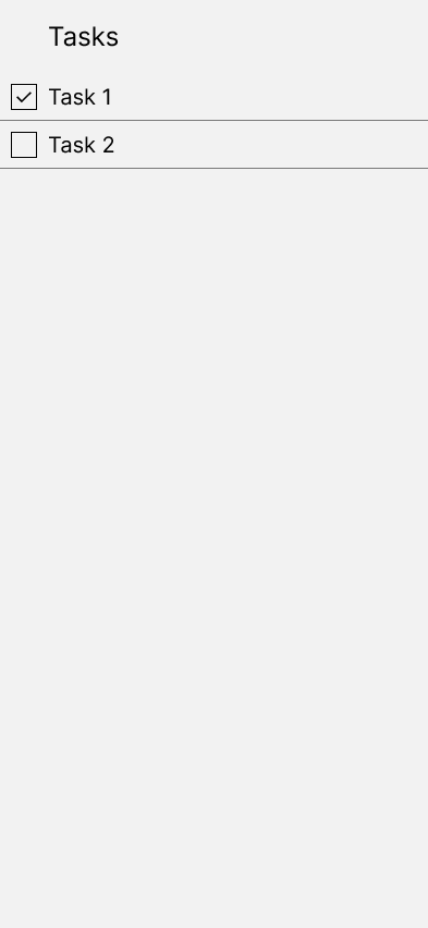
Our app for now only consists of a list of tasks, so we can simply put them below each other:

Add tasks
A general habit is to create a large, highlighted button with a + indicator on it, and put it in the footer.
In lists, it’s also common practice to make the last item an input for adding new items to the list. This allows for adding multiple items easily without obstruction by not removing the focus from the input, also allowing keyboard navigation.
To compare, if we would only rely on the + button, the flow to create multiple tasks would look like:
- Press + button
- Input task name
- Press Save
- Repeat from step 1
With our input solution:
- Press + button/focus input
- Input task name
- Press Save
- Repeat from step 2
We saved one step by not having to press the add button every time, which in 100 tasks means 99 less button press.
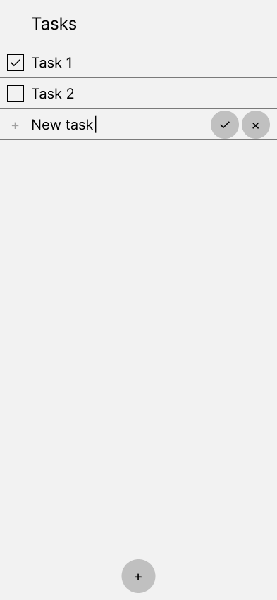
It will look like this:

Pressing the input, or pressing the + button will put focus on the Add task input, and upon focus controls will appear next to the input:
- ✓ button will create the task with the name in the input, leaving focus on the input
- × button will discard the operation, removing the focus from the input, and not creating a new task
Edit task
There are two properties of a task for now:
- completion status
- name
Completion status
The completion status property is a boolean (true/false), so a checkbox is appropriate to use here, and is generally placed before the task name. Pressing it would mark the task as completed/not completed.
Name
We had three ideas for editing name:
- cannot be changed (delete existing task, and create a new task)
- edit in place (upon pressing the task name, turn it into an input field)
- edit in modal (upon pressing the task name, show a modal, and let details be changed there)
The reason we went with the last idea is because:
- accidental presses would cause obstruction especially on mobile (keyboard pop up)
- additional task properties will probably be added in the future (e.g. due date, labels, priority)
- delete button can be placed in the modal
Delete task
We had two ideas for deleting tasks:
- when hovering (move the cursor to) the task, display a thrash icon that would delete the task when pressed
- show delete button in modal after pressing the task
We chose the last idea because we already made the decision to show a modal to edit the task name, and because there’s no hover in mobile.
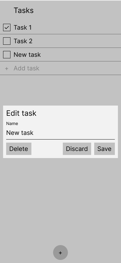
The modal would show on an overlay, showing:
- edit task heading (to let the users know what they are doing in the modal)
- edit task name input
- controls
- delete (to delete the task)
- discard (to close the modal)
- save (to save the changes made to the task)
The modal would look like this:

Wireframe designs
You can see the "final" wireframe designs for both mobile and web here:
Next steps
Now that we have a clearer picture on what we are building, we can start styling with the theme for the app, and apply the design components we need:
- typography (headings 1-4, body, note)
- buttons (primary, secondary, outlined, ghost)
- input with label
- checkbox
- modal
With the wireframe, we can create user stories, and work out the expected behaviour in more details.
Let’s have a look at how the project looks like at the moment, and what is on the roadmap for the upcoming week.
The design team has to finish creating the theme, and necessary design components in detail. The development team can sequentially implement each component as the design team finishes them.
In the next design post, we will demonstrate theming, and creating design components.
The development team also made progress on initialising the codebase, and we will cover that too in the next post.