 GERASOFT
From Idea to App - Designing the Task Management Screens
First we created the app’s wireframe, then created a theme for the app, with a design system including typography, variables, and necessary components.
Now we will style our initial wireframes with the design system we created following the user stories:
- display task
- change task completion status
- create task
- edit task name
- delete task
You can see the tickets for this post in this ClickUp board
For context, it is recommended to see how the wireframes were made in our previous post: From idea to App - How to create Wireframes.
We are going to give them some style. Let’s get into it!
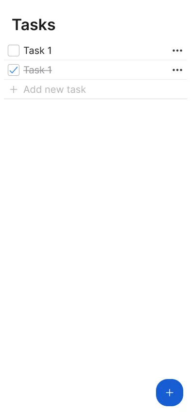
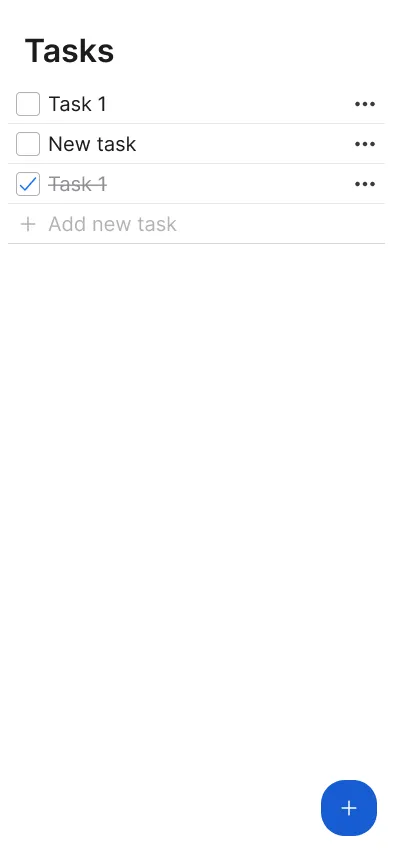
Display task
ClickUp ticketEach task consists of:
- A checkbox (large variant) indicating completion status
- The task name, styled with the large body typography variant
- A horizontal ellipsis to mark that the button is actionable
The parts are wrapped in a ghost button with a slight border radius.
To improve readability, tasks are separated by a subtle line.
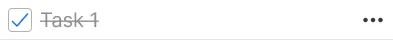
State Changes:
- Due Tasks - Empty checkbox, standard text
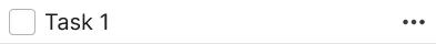
- Completed Tasks - Checked checkbox, strikethrough text
At the top of the view, we have a H2 with content “Tasks” to provide context.
Change completion status
ClickUp ticketUsers can mark tasks as done or undone by pressing the checkbox.
To make interactions easier, we removed padding from the button container, allowing the actions inside—checking off a task and selecting it for editing—to have a larger hit area by using their own padding.
Edit task name
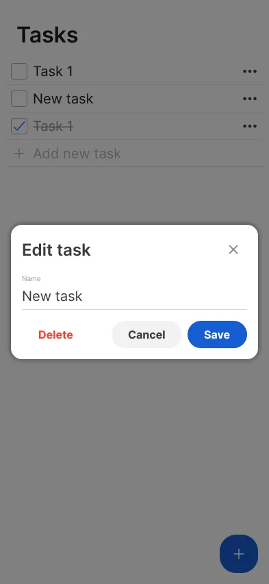
ClickUp ticketBecause we are not expecting this to be a very frequent action, we decided to put the functionality of editing a task in an isolated modal.
The ellipsis on the right side of each task indicate that actions can be made on it, and hovering over it will change its background color as the button’s default behaviour.
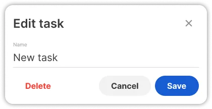
Pressing the task (except the checkbox) opens the modal
The modal has the following parts:
- Title: "Edit Task"
- Input Field: Large underline input pre-filled with the task name
- Actions:
- Delete button - Triggers delete confirmation modal
- X button - Closes the modal without saving
- Cancel button - Closes the modal without saving
- Save button - Updates the task and closes the modal
Delete task
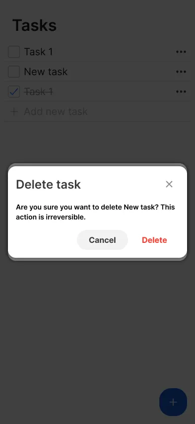
ClickUp ticketWe found deleting a task from the edit modal intuitive enough.
Pressing Delete opens a confirmation modal where users must confirm before the task is removed. This prevents accidental deletions.
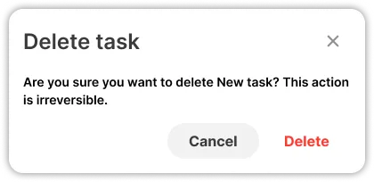
Confirming deletion closes both the delete and edit modals, and removes the task from the list.
Pressing Cancel or X button closes the delete modal, and returns the user back to the edit modal.
Create task
ClickUp ticketSince adding tasks is expected to be the most frequent action, we designed a fast and intuitive way to do it.
There are two triggers to create a task:
- one is a large underline input below the task list with placeholder “Add new task”
- the second is a large primary + button in the bottom right corner of the screen (pressing it moves focus to the the input)

Once the input is focused:
- the underline turns blue, indicating focus
- as native behaviour of input fields, the caret will blink
- a checkmark, and a cross icon will appear at the right side of the input
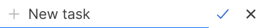
When the user enters a name for the new task, it will be created by either pressing the checkmark, or pressing Enter. This will clear the input field, but leave the focus inside the input, allowing for quick creation of multiple tasks.
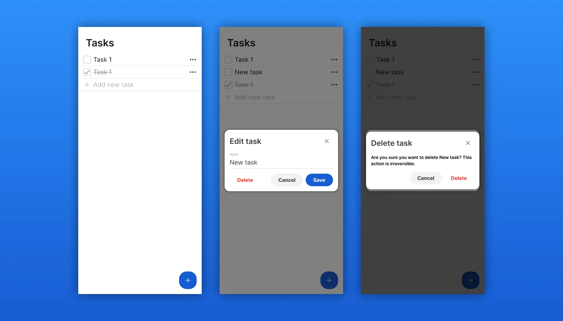
Final screens
Putting together the components we've made, here are the screens for each stage:
Main view
Adding task

Added new task
Editing task
Deleting task
Designs
Full designs including the initial wireframes can be found in the Figma file:
The prototype can be tried out using this Figma link.
Wiki of the design system can be found in this ClickUp document.
You can see the tickets for this post in this ClickUp board
Next steps
As development is implementing the functionality of the designs covered in this post, we can continue with designing the authentication screens as required in the user stories.
This is what is upcoming:
In the next post we will implement a live working prototype, and we will guide through the code on how it was made.