 GERASOFT
From Idea to App - How to create a Design System
In this guide, we'll demonstrate how to build a structured design system, ensuring consistency, scalability, and efficiency in both design and development.
Why a Design System?
A common mistake in UI design is creating elements “from gut”, choosing spacing, font sizes, and colours arbitrarily. While this can sometimes lead to visually appealing designs, it introduces serious issues:
- Inconsistency - Harder to create matching designs.
- Inefficiency - Manually specifying values slows down the process in the long run.
- Developer Overhead - Harder for developers to implement without clear rules.
To avoid this, we use variables for standardised design tokens and components to create reusable elements.
Design System: Variables
Before designing components, we first need to define core variables:
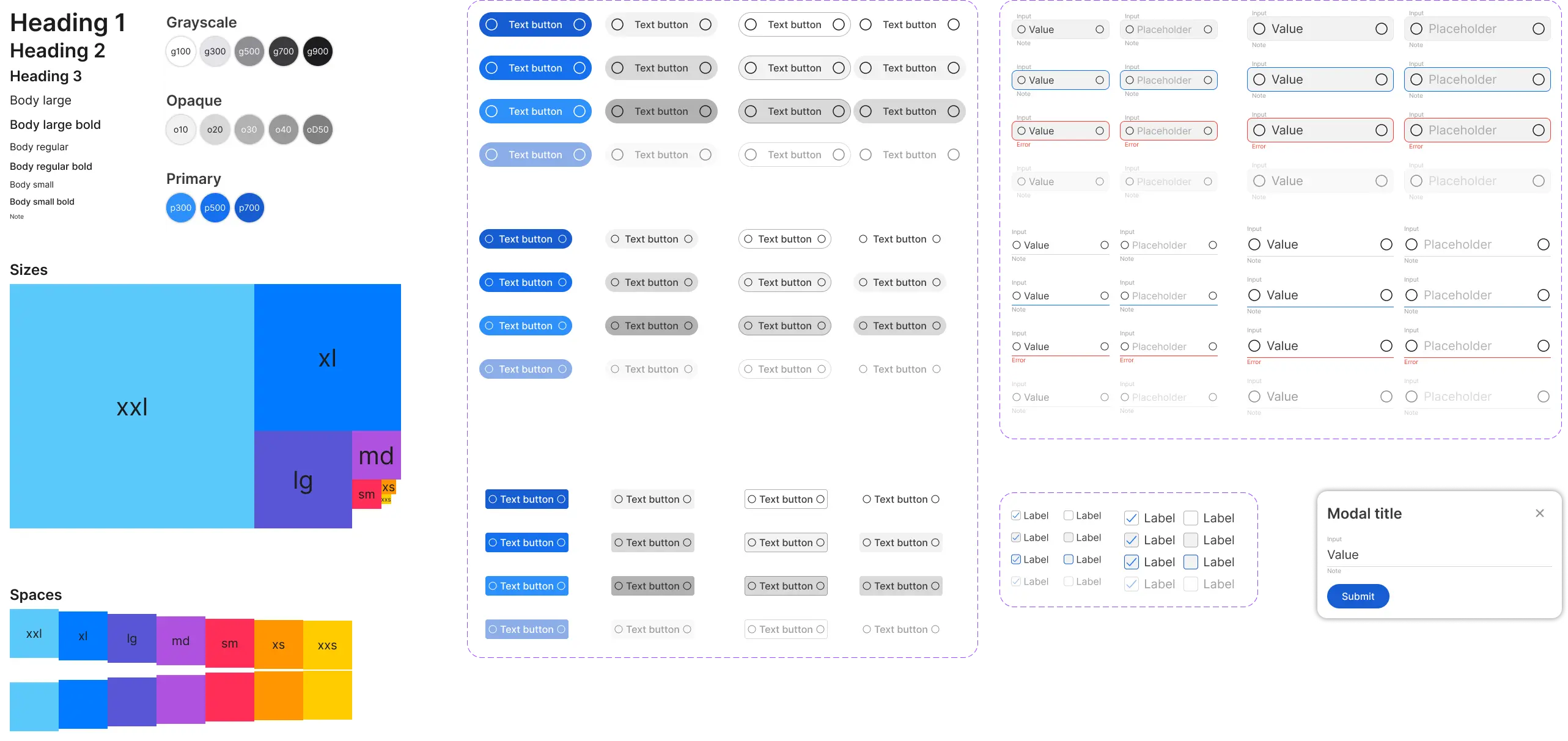
Typography
Instead of defining font sizes individually, we use predefined text styles.
- Headings (H1, H2, H3) - Used for page and section titles.
- Body Text (Large, Regular, Small, Bold) - Standard content styles.
- Notes - Subtle annotations or helper text.
These styles ensure scalability and readability across all screens.
We will use the popular Inter font family throughout the project.
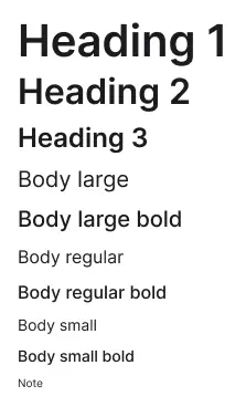
Colours
A structured colour system eliminates inconsistencies, and makes updating, and maintaining the design system easier.
We aimed for simplicity by keeping only a limited set of colours. A smaller palette is easier to maintain, and prevents visual clutter by providing a more consistent appearance.
We define colours under three categories:
- Grayscale - Used for text, backgrounds, and borders.
- Opaque - Transparency levels for overlays.
- Primary - Main brand colours.
By using design tokens (e.g., g500, p700), rather than hardcoded hex values, we ensure that updates happen system-wide without breaking UI consistency.
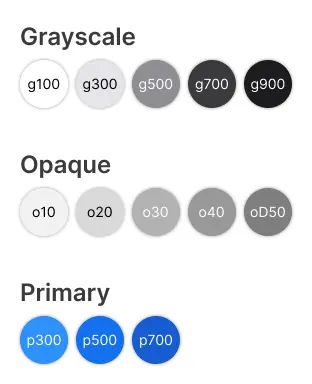
Sizes
Sizes define the dimensions of components such as buttons, modals, and containers.
Defined size values: xxl, xl, lg, md, sm, xs, xxs
Use cases:
- Buttons - Predefined height and padding.
- Modals - Standardised width and height scaling.
- Text Inputs - For uniform field dimensions.
By keeping a fixed scale, designs remain balanced and predictable.
Spaces
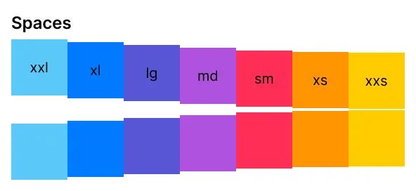
Spacing defines the gaps between elements, ensuring consistent layouts.
Defined spacing values: xxl, xl, lg, md, sm, xs, xxs
Use cases:
- Padding - Space inside elements (e.g., inside buttons, inputs).
- Margins - Space between components.
- Grid Layouts - Defining structured spacing between sections.
Using a consistent spacing system prevents arbitrary values and keeps layouts aligned.
Design System: Components
Once variables are defined, we use them to create reusable components.
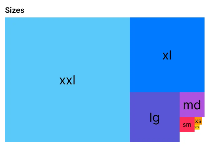
Buttons
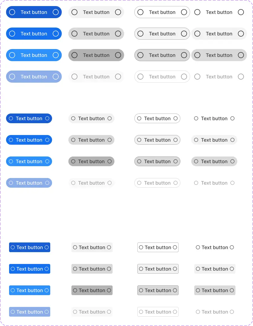
Buttons are essential interactive elements in any UI, allowing users to perform actions.
Defined properties:
- Variants - Primary, secondary, outline, ghost.
- States - Default, hover, pressed, disabled.
- Sizes - Small, medium, large.
- Icons - Left/right support.
By leaving the text empty on the button, with this component we can also create icon buttons.
Inputs
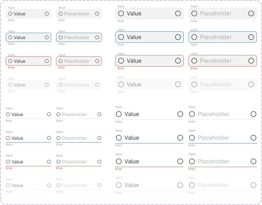
Inputs must be consistent and accessible across forms.
Key features:
- States - Default, focused, error, disabled.
- Value Handling - Supports placeholders and predefined values.
- Error Messaging - Prioritises error text over helper notes.
- Icons - Can include left/right icons for additional context.
We've created two variants - outline and underline - and two sizes for different scenarios.
Checkboxes
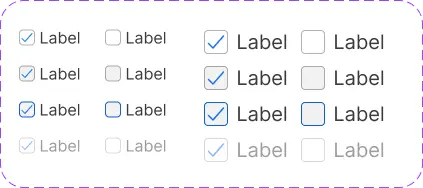
Checkboxes allow users to make clear, binary selections.
Properties:
- Size - Medium or Large
- Value - Checked / Unchecked
- States - Default, hover, focused, disabled.
Each checkbox should include labels for accessibility.
Modals
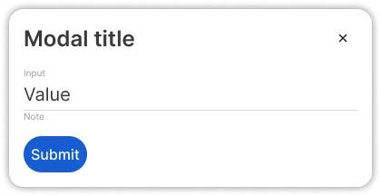
Modals provide structured overlays for user interactions.
Modal structure:
- Title - Defines the purpose.
- Close Button - Allows users to exit.
- Content Area - Supports text, forms, or interactive elements.
- Controls - Customisable buttons (e.g., Submit, Cancel).
To prevent usability issues, modals should trap focus and support keyboard navigation.
Maintaining the Design System
A design system is only effective if it’s followed. Small deviations can lead to inconsistencies and hard-to-maintain code. To keep the system intact:
1. Follow the Rules
- If an element does not fit within the system, consider redefining a component rather than introducing custom elements.
- If new functionality is required, update the global components rather than making isolated changes.
- Implement responsive design by using auto-layouts, and using fill/hug constraints instead of explicit values to ensure components adapt to different screen sizes
2. Use a Single Source of Truth
Avoid hardcoding values in documentation. Instead, reference the Figma design file or token system.
Example: Instead of p500 = #007AFF, use p500 - Primary Colour (See Figma).
3. Ensure Design & Development Alignment
Developers should mirror the same tokens and components from the design system in the codebase.
This eliminates the need to recalculate padding, font sizes, or colours manually.
Designs
Full designs can be found in the Figma file:
Wiki of the design system can be found in this ClickUp document.
Next steps
Now that everything is ready in the design system for us to style the wireframes of the app, we are going to design each component of the tasklist app following the instructions in the user stories.
In the meantime development has been implementing the design system to code in sync with design, and we will continue to work in parallel on the user stories as well.
In the next post we will see how the design system has been implemented in code, so stay tuned!